Posts

Showing posts from April, 2023

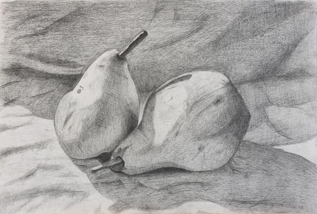
Finished Cross-Hatched Style Still-Life

Image
 Final Cross-Hatched Style Still-Life: For this still-life piece I used a technique referred to as "Cross Hatching" to shade the two pairs in my new still life setup. Similar to my realistic still life, this was completed in my conservatory between 1-5pm, however, the main difference being the weather. That day was a particularly overcast day which required me to put my setup inside a box to try and get stronger shadows. Overall, however, this did result in a weaker still-life setup. Overall, I believe this was a success, however weaker than my realistic shading still life. Shading in cross hatch is particularly hard as big areas such as the sheet in the background was hard to shade without looking "scratchy". This piece took significantly more time, but the harsh contact shadows, wrinkles and bounce lighting on the right pear do help this piece stand out. Cross-hatching is a style I need more practice for. References:

Finished Realistic Still Life

Image
 Final Realistic-Shaded Still Life For this piece I setup a still-life containing two pairs on a wrinkled white sheet. This was setup during between 1-5 pm on a sunny day inside my conservatory. A big problem with drawing from a still life setup is the constant changing shadow directions. For this a white lamp would be better as a consistent source, however, I did not have one handy. Overall I believe this one of my stronger peices of drawing. The shading of the stalk displaying harsh light direction, the overall volume, wrinkles on the sheet, dark contact shadows and bounce lighting on the left pair show an understanding of the techniques needed to draw a still life. References: :

Finished Character Turn-around

Image
 Final Character Turn-Around My final character turn around represents a wounded knight taken over by nature. Sprouting a root with a leaf out of his left shoulder, and his wound having internal roots holding him together. In this piece I exaggerated the size of the root and more importantly the leaf to signalize that nature was truly taking him over. However, I also wanted to also symbolize he is a danger to be reckoned with. For this I exaggerated size the sword in his right hand. However due to page size limitation I had to cut off the sword early in all perspective turn arounds. Overall, I believe this piece was a proportional and volumetric success. However, I believe some parts of his design could be further exaggerated such as the root/nature element. In future iterations integrating more roots and vines to his design would improve the cohesion. References:

Draft Character Turn-Around

Image
  Draft Character Turn-around For my draft turn around I needed to work out the exact proportions, twist directions and angles of my character. I used guiding lines to determine my 3/4 turns and used internal shading to determine volume. The general design represents a wounded and weakened position. This is signified by the posture; with weakened knees, slightly hunched over neck position, a relaxed right hand and his left hand covering a wound. Originally the hand was lower down, however, this was moved due to reasons obvious in the back turn around to most (except me). References: I referenced postures and volumes from an anatomy book and an array of images sent via my lecturer, As i do not know the copy or redistribution rights, I will exclude them from this section. However i can include my hand position references:

Finished Creative Piece

Image
 Final Creative Piece Created in A3, this concept was designed from a variety of reference images as well as the final design from my thumbnail collection. The creation of this piece was difficult due to the amount of bounce lighting through multiple windows and a dominant lighting direction. Overall I believe while the lighting has been completed to relative success, the overall composition needs work, especially the table on the bottom left that needs to be moved closer. The creative piece displays a near empty church/chapel with strong outside direction lighting coming in the left hand side. References I used the same references from the thumbnail designs as well as the peices shown below from bloodborne and dark souls 3:

Final Thumbnail Designs

Image
 Finished Thumbnail Designs These are my finished thumbnail designs. Overall, I believe the level of contrast, line weighting and designs are of required quality to use as a basis for an A3 creative piece. In the top left thumbnail, I experimented with a perspective railing and a directional outside shadow. As the fire was added as an additional final element, the brightness of the yellow inside could not be correct due to pervious shading. Below was my first experiment with extreme depth. Here I used value and contrast to separate objects in the background from each other. I believe, however, better contrast with the use of darker and lighter buildings could be applied. Further below was the my first experiment with a point light, here I used a dark gloom to overshadow the whole environment and added a lantern in the center to light up the surroundings. I added detail to the tiles to simulate contact shadows. I believe this was applied well but the wall shadows and tiling could be imp

Thumbnail Designs

Image
  Early Thumbnail Designs Creating thumbnails is an iterative process, starting with smaller designs "The size of your thumb", These are used to gauge values and general designs to then create bigger more intricate versions. They show basic levels of depth, line weight and shadow directions.