Painting Creative Piece
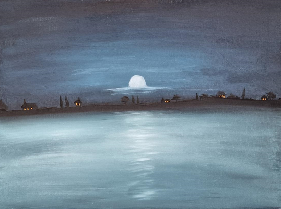
Overall, I believe this piece was a success. I attempted to recreate a combination of some of Claude Monet's work using a CMY (Cyan, Magenta, Yellow) modern color palette. Originally, I intended to use a triad of colors featuring Cyan, Yellow, and Magenta as my primaries. However, while painting, I became immersed in the creation of the sea and clouds, and I believe this piece suits a double primary palette better than a triad.
The addition of the double primary palette enhances the overall effect of the artwork. The yellow-orange lights on the buildings breathe life into what would otherwise be a dull and eerie scene. These vibrant hues provide a striking contrast against the darker elements, creating a captivating visual interplay. Meanwhile, the use of blue and cyan tones for the sea and clouds adds a moonlit ambiance, evoking a sense of calm and tranquility. These colors lend a dreamlike quality to the piece.
Ultimately, I decided not to use magenta on the trees in the foreground. The reason behind this choice was the realization that the big, vast open area of water portrayed a profound sense of loneliness and calmness. Adding trees in that area would have cluttered the composition and detracted from the overall simplicity and effectiveness of the artwork.
By omitting the magenta trees, I aimed to emphasize the serenity and tranquility that the open water conveys. The absence of additional elements allows the viewer's gaze to wander and get lost in the expansive scene, evoking a contemplative mood. The simplicity of the composition enables the viewer to fully immerse themselves in the solitary ambiance that pervades the artwork.
Reference historical artworks:
To create this piece, I drew inspiration from a variety of artists' styles and approaches, particularly Richard Anderson and Scott Naismith. These two artists served as my primary sources of inspiration for the type of scene I wanted to create. I aimed to combine the tranquil structure characteristic of Scott Naismith's work with the color palette and sense of calm evoked by Richard Anderson.
Scott Naismith
Pureref Mood board:


Comments
Post a Comment