Posts

Life Drawing - Gestures

Image
  Here are 10 sketches I created based on online photos of people posing. Being an online student, I couldn't draw from real models, but it turned out to be a valuable learning experience. I intentionally chose diverse poses, incorporating twists and exaggerations, while following the C.I.S guide, which emphasizes using C, S, or I curves in drawings. I made sure to select images that offered a range of different postures. In the drawing process, I started with a guiding line to capture the movement, then formed a bean shape to outline the torso. Adding curves extending from the bean, I crafted the legs, arms, and neck. Finally, I included a cranial circle as the foundation for the head, refining it into a mannequin-style representation. For the finishing touches, I added shading to give depth, a simple grasp of the scene's lighting, and a rough representation of the muscle grouping. I'm generally satisfied with my gestures, but there's room for improvement, especially i...

Final - Still Life

Image
Overall thoughts and learnings: For my final art piece, I chose to create a still life composition. My aim was to strike a balance between a challenging subject that would push my developing skills and not overextending myself with something overly complex. In this composition, I featured a small pear, a green apple, and a mug with a paintbrush resting inside its handle. The most demanding aspect of this piece was achieving the correct interplay of shadows, particularly on the mug and between the various fruits. The fruits themselves presented an intricate play of multiple shadows, cast both by the mug and by each other. While I believe I managed the shadows reasonably well, there's definitely room for improvement, particularly in refining the values. One of the challenges I encountered was finding the right values for the pear. Initially, they appeared too bright, and I only discovered this after working on the piece and comparing values. I went back and darkened the pear, but I f...

Painting Creative Piece

Image
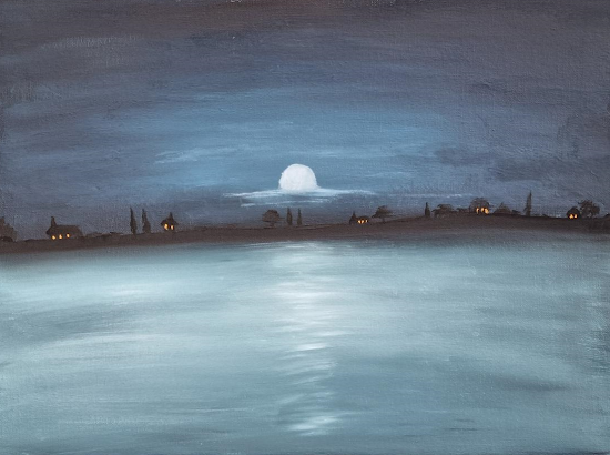
  Overall, I believe this piece was a success. I attempted to recreate a combination of some of Claude Monet's work using a CMY (Cyan, Magenta, Yellow) modern color palette. Originally, I intended to use a triad of colors featuring Cyan, Yellow, and Magenta as my primaries. However, while painting, I became immersed in the creation of the sea and clouds, and I believe this piece suits a double primary palette better than a triad. The addition of the double primary palette enhances the overall effect of the artwork. The yellow-orange lights on the buildings breathe life into what would otherwise be a dull and eerie scene. These vibrant hues provide a striking contrast against the darker elements, creating a captivating visual interplay. Meanwhile, the use of blue and cyan tones for the sea and clouds adds a moonlit ambiance, evoking a sense of calm and tranquility. These colors lend a dreamlike quality to the piece. Ultimately, I decided not to use magenta on the trees in the foregr...

Colour Study - Cut Green Capsicum

Image
  Above, you can see my attempt at recreating a cut-open green capsicum. Overall, I believe the artwork bears a resemblance to the subject, but there are some areas that could be improved. One particular area of concern is the depiction of the seeds. While the seeds on the left side of the capsicum appear close to the desired result, the ones on the right side lack the necessary highlighting. This is an area where I acknowledge the need for improvement. I encountered difficulties in detailing the seeds and ended up using broad brush strokes and darker shades in an attempt to achieve some variation. If I had more time, one additional element I would have incorporated into the artwork is the addition of shading underneath the capsicum. I could have rendered the appropriate shadows to create a sense of depth and enhance the overall realism of the piece.  Reference Photo:

Tonal value study

Image
Here is my attempt to recreate an environment using only black and white tones. While I believe this piece successfully captures the overall tonal values of the scene, it lacks some details and highlights. However, I aimed to create a more natural feel by working from back to front, allowing the background to subtly influence the foreground as I painted with block colors. Upon further reflection, I believe that the white values in the piece are slightly too bright. To create a closer match to the original image, I think it would be beneficial to reduce all the values by a fraction. Reference Photos:

Finished Cross-Hatched Style Still-Life

Image
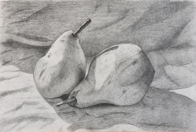
 Final Cross-Hatched Style Still-Life: For this still-life piece I used a technique referred to as "Cross Hatching" to shade the two pairs in my new still life setup. Similar to my realistic still life, this was completed in my conservatory between 1-5pm, however, the main difference being the weather. That day was a particularly overcast day which required me to put my setup inside a box to try and get stronger shadows. Overall, however, this did result in a weaker still-life setup. Overall, I believe this was a success, however weaker than my realistic shading still life. Shading in cross hatch is particularly hard as big areas such as the sheet in the background was hard to shade without looking "scratchy". This piece took significantly more time, but the harsh contact shadows, wrinkles and bounce lighting on the right pear do help this piece stand out. Cross-hatching is a style I need more practice for. References:

Finished Realistic Still Life

Image
 Final Realistic-Shaded Still Life For this piece I setup a still-life containing two pairs on a wrinkled white sheet. This was setup during between 1-5 pm on a sunny day inside my conservatory. A big problem with drawing from a still life setup is the constant changing shadow directions. For this a white lamp would be better as a consistent source, however, I did not have one handy. Overall I believe this one of my stronger peices of drawing. The shading of the stalk displaying harsh light direction, the overall volume, wrinkles on the sheet, dark contact shadows and bounce lighting on the left pair show an understanding of the techniques needed to draw a still life. References: :