Posts

Showing posts from June, 2023

Painting Creative Piece

Image
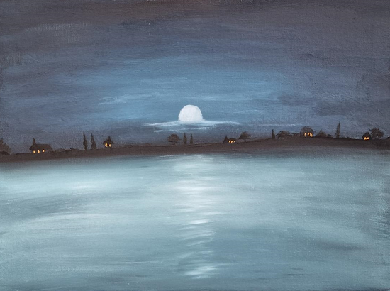
  Overall, I believe this piece was a success. I attempted to recreate a combination of some of Claude Monet's work using a CMY (Cyan, Magenta, Yellow) modern color palette. Originally, I intended to use a triad of colors featuring Cyan, Yellow, and Magenta as my primaries. However, while painting, I became immersed in the creation of the sea and clouds, and I believe this piece suits a double primary palette better than a triad. The addition of the double primary palette enhances the overall effect of the artwork. The yellow-orange lights on the buildings breathe life into what would otherwise be a dull and eerie scene. These vibrant hues provide a striking contrast against the darker elements, creating a captivating visual interplay. Meanwhile, the use of blue and cyan tones for the sea and clouds adds a moonlit ambiance, evoking a sense of calm and tranquility. These colors lend a dreamlike quality to the piece. Ultimately, I decided not to use magenta on the trees in the foregr

Colour Study - Cut Green Capsicum

Image
  Above, you can see my attempt at recreating a cut-open green capsicum. Overall, I believe the artwork bears a resemblance to the subject, but there are some areas that could be improved. One particular area of concern is the depiction of the seeds. While the seeds on the left side of the capsicum appear close to the desired result, the ones on the right side lack the necessary highlighting. This is an area where I acknowledge the need for improvement. I encountered difficulties in detailing the seeds and ended up using broad brush strokes and darker shades in an attempt to achieve some variation. If I had more time, one additional element I would have incorporated into the artwork is the addition of shading underneath the capsicum. I could have rendered the appropriate shadows to create a sense of depth and enhance the overall realism of the piece.  Reference Photo:

Tonal value study

Image
Here is my attempt to recreate an environment using only black and white tones. While I believe this piece successfully captures the overall tonal values of the scene, it lacks some details and highlights. However, I aimed to create a more natural feel by working from back to front, allowing the background to subtly influence the foreground as I painted with block colors. Upon further reflection, I believe that the white values in the piece are slightly too bright. To create a closer match to the original image, I think it would be beneficial to reduce all the values by a fraction. Reference Photos: